
My role
UX design lead on the project. Worked in a agile environment with developers, QA, product owner, digital project manager, business analyst, solution architect, and scrum master.
My responsibilities included: user research, product strategy, competitive analysis, content strategy, user flows, sketching wireframes, interactive prototypes, in person and remote usability testing, visual design, interaction design, and communicating specs to developers.
Problem statement
The process for reseting password for online banking doesn't work for our users. Out of six million password reset attempts in a year, only 30.000 (5%) are successful. 80% of attempts are made on mobile devices and currently the feature is designed only for desktop use, rendering poorly on mobile.
Through analytics and user research, we found out that our customers encounter friction in several places in the process, and the only way to move forward and reset their passwords is to call BMO Customer Centre.
We began our process by examining each step of the flow. Analytics and data provided by Customer Contact Centre (user comments and complaints) allowed us to identify the roadblocks that stopped users for completing the flow.
Business goals
- Increase the self-serve password reset completion rate.
- Lower the need to contact Customer Centre regarding password resets.
User goals
The ability to reset their online banking account password quickly, easily and through a trustworthy and secure process.
Eliminate the need to call Customer Contact Centre or leave the channel to be able to reset their password.
Challenges
Find a way to authenticate users that is straightforward and easy, but consistent with a high level of security.
To take advantage of smartphone functionalities and input devices (camera, biometrics) we need to create two separate experiences - one for the native app, and a second one for the desktop website. Is this feasible in terms of budget, time?
Our users
Immediate focus
- Age: 18-50
- Uses primarily mobile for online banking.
- Prefers to do banking digitally, rather then going to the branch.
- Main actions: pay bills, transfer money between accounts, deposit cheques.
- Logs in 3-4 times per week.
- Logs in on the go.
Future focus
- Age: 35-65
- Needs a value add to become motivated to enrol to online banking.
- Performs banking activities in person. 3x more likely to pay a bill in branch.
- For digital banking these users prefer to use desktop.
Design Solution
One important characteristic of this flow was the introduction of a two-factor authentication method to identify users. The solution we decided on was to send a one-time passcode to the users' phone number or email address.
For the first release we focused on the mobile app, since analytics data and user interviews identified that 80% of our users would reset their password on their phones.
After setteling on a solution, I created user flow diagrams. I reviewed them with the business and our developers to get an estimation of time and feasibility of the proposed redesign. I iterated and presented the solution to our fraud and info security teams to be certain we were compliant with the bank's security standards.

Sketches


Wireframes and prototyping
I researched other apps and password reset flows to understand best practices and design patterns. I used Sketch and Invision to create wireframes, high-fidelity designs and interactive prototypes. I tested with users and iterated designs.

Visual treatment
I followed the BMO design system to create a sense of branding and continuity. Form fields are inspired by Google Material Design. We use bold headings to create contrast. For primary CTAs we use the BMO blue pill buttons.
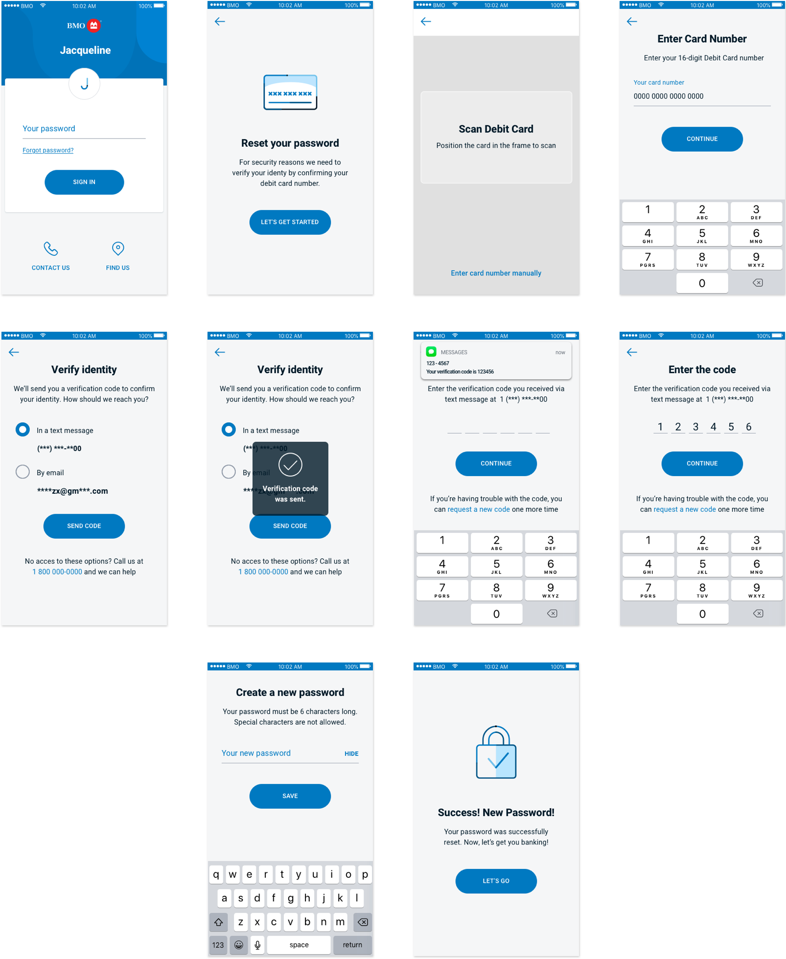
Two-factor authentication
Scan card
Before the user can change their password, they need to identify themselves and prove they are who they claim. We request them to provide their debit card number and a pass code that we send to their phone number or their email.
Usability testing has shown that users prefer to scan their debit card than enter the sixteen digits manually. This method is faster and lessens the possibility of error.


One-time verification code
We replaced security questions with a safer and easier method of authentication - a verification code sent through a text message or an email.
Users can choose the method they prefer for receiving the code. Their information - phone number and email address are partially masked for security reasons.


A/B usability testing
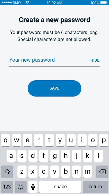
Password reset was designed specifically for the mobile app, and I wanted to create an experience that took advantage of the privacy offered by the phone. I envisioned the password creation screen with only one input field and the password revealed by default when typed. This way, it would have saved the user taps and typing, and the phone would have been personal enough to protect the user from someone else seeing their password.
The other option was to keep the password masked at all times and use two fields - one for entering a password and the second for confirmation.
I conducted remote A/B testing. Users were asked to set up their password using two separate versions of the mobile and desktop prototypes:
- Toggle to show/hide password
- Second field for confirming the password
The goal for this test was to answer the following questions:
- Do customers prefer typing their password twice to confirm or do they prefer typing it one time with the option to show/hide?
- Did they think the 'confirm password' field was necessary?
- Did they notice the show/hide toggle?
- Did they use the show/hide toggle?
Design A

Design B
Which design was the winner?
32%
Preferred Design A – hide/show toggle
64%
Preferred Design B – confirm password field
4%
Expressed no preference
Why did 32% of users prefer show/hide password?
- Ability to check that there are no mistakes with the password.
- Users have the chance to see the password in plain text.
- It streamlines the process, making it faster and easier.
Disadvantages
- Many users gloss over the show/hide, do not use it, nor do they see it.
- In a public setting: If the user can see it, anyone may be able to see it.
- By typing fast and not using the show/hide button, the user may be subject to typos and will have to redo the entire process.
Why did 64% of users prefer a second field to confirm password?
- It felt safe and secure.
- The second field reassures that their password is correct and there are no typos.
- It follows the steps that are normally required when resetting the password (universal and familiar flow).
- It's simple, easy, and minimalistic.
Disadvantages
- It can take a few seconds more than show/hide password.
Desirability testing
One challenge I encountered was bringing everyone on the same page regarding the visual design details. To solve this I conducted an in-person desirability study.
I selected three versions for testing
- Design 1 – streamlined and functional, with no distracting visual elements.
- Design 2 – the visual design team suggested an illustration to make the design more relatable.
- Design 3 – the business suggested the addition of a step progress indicator. Also, the blue bar was added to showcase the brand.
The goal was to get the emotional reactions and preference of the participants. I gave the users 25 cards with adjectives and asked them to place a card on the design it described best. I asked them to use at least 6 cards however they liked.
Design 1
- Expected
- Clear
- Efficient
- Relevant
- Effortless
- Straightforward
- Clean
Design 2
- Desirable
- Trustworthy
- Inviting
- Attractive
- Irrelevant
- Annoying
- Distracting
- Dated
Design 3

- Trustworthy
- Attractive
- Informative
- Irrelevant
Desirability test results
3 out of 5 users preferred Version 1, as it was clean and straightforward. They felt that illustrations were irrelevant.
Next Steps
Release > Learn > Iterate
Explore biometrics as a means of identification (replacing security questions with face id, fingerprint id, or voice recognition)
Explore software tokens for one-time passwords (Google Authenticator)
Success metrics
The BMO mobile banking app's rating in the Apple App Store jumped from 3.2 to 4.7 stars following the release of the password reset feature.
This feature is also expected to reduce contact center calls, saving the bank an estimated $1.8 million in the next fiscal year.