Context
I redesigned the activity section to offer users more transparent information and help them make informed decisions on trading strategies.
As a result, we increased trust and improved retention.
Role
Senior UX Designer, leading UX and UI efforts.
User research, strategy, interaction, visual design, prototyping, testing.
Collaborated with the design team, product manager, customer service, sales and engineering.
The Problem
The trader activity section lacks important information essential for trading strategies. Additionally, the information is inconsistent across Android, iOS, and web apps.
Insights from stakeholder and user interviews
I began my research by auditing our various platforms, documenting inconsistencies, usability issues, and missing functionalities.
To verify my findings, I interviewed seven stakeholders from the sales and customer service teams. They highlighted the most common complaints and requests from our users:
- Stakeholder input
- Transaction fee breakdown per trade
- Trade history with all transactions
- Clear and standardized transactions naming
- Filtering and sorting on mobile devices
I wanted to hear directly from users and watch how they use the activity section. I conducted exploratory in-person interviews with four users. Their primary reason for visiting the activity section was to review their financing or overnight fees.
- User expectations
- Fee per trade/instrument, with comparison
- Profit/loss in price and percentage
- Filter by closed trades
- Transactions grouped by trade
Design challenges
Our UI goals include: ensuring consistency across all platforms, designing for both dark and light mode, and achieving AA compliance. I aimed to create reusable components for the design system, leveraging existing elements where possible.
A key design challenge was maintaining similar functionality and appearance across desktop and mobile platforms. Adopting a mobile-first approach, I initially designed for our mobile apps and then scaled the designs to desktop.
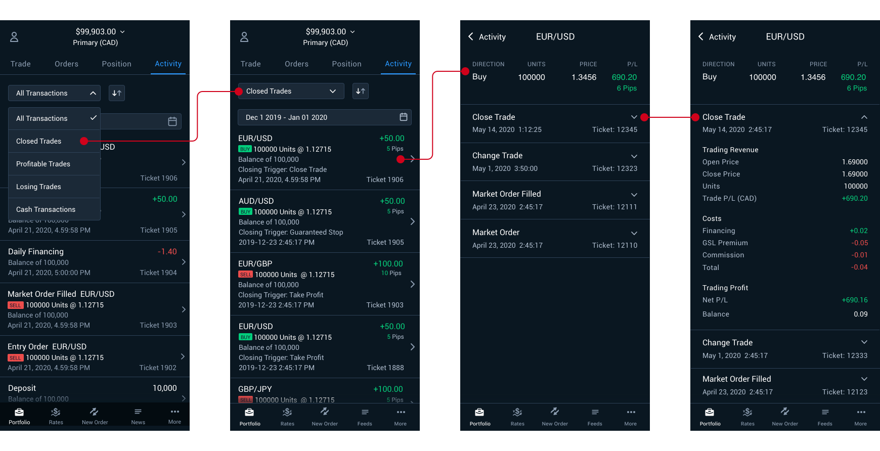
Mobile - Iteration 1
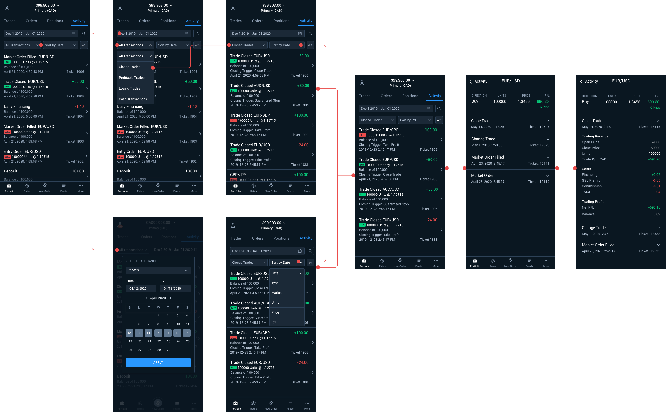
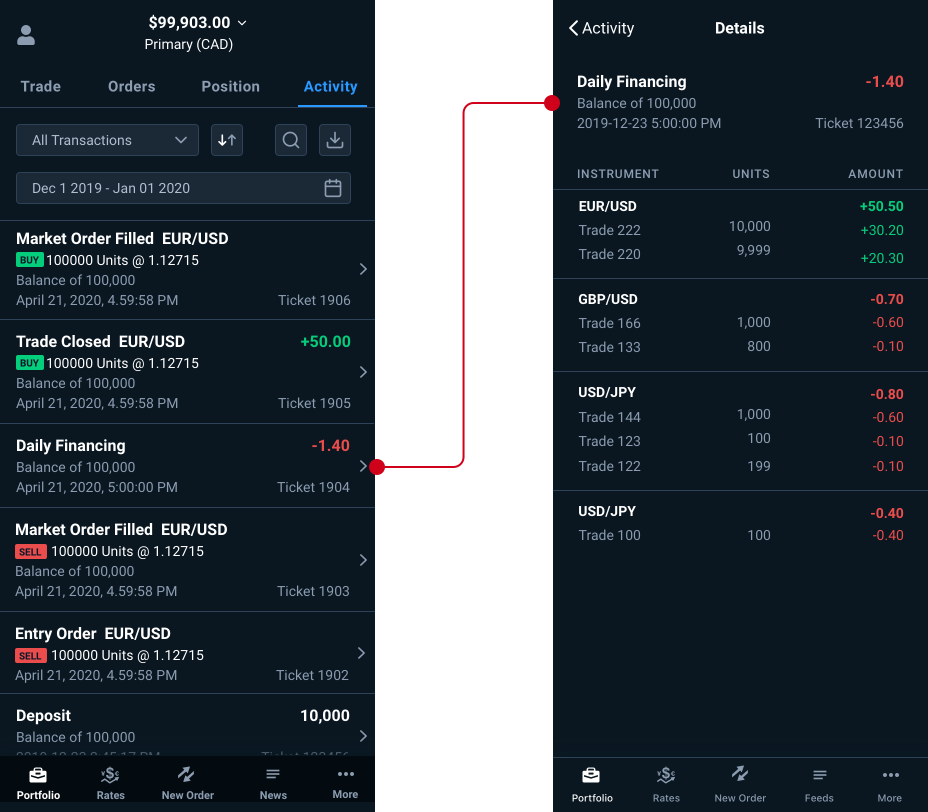
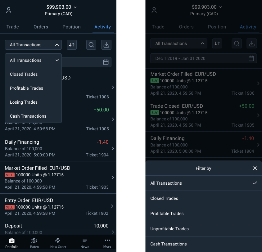
The data table on mobile is presented as a list, displaying important information at a glance. Swiping on an entry opens a detail screen with more comprehensive information. For instance, the main view aggregates the overnight financing cost, while the detail screen provides a breakdown by position and trade. Users can sort and search.
Nice to have functionality includes a date picker for viewing transactions from previous months or years, and an option to download csv files.
Validate designs with stakeholders and users
I presented the designs to stakeholders, who supported the introduction of detail screens for presenting additional information. This approach aligns with our company's values of transparency. We decided to break the project into phases, prioritizing the implementation of the most valuable features first.
I conducted usability testing to observe how traders use these features on mobile. Actions such as downloading .csv files and searching transactions are more common on the web than on mobile. Traders expressed a strong preference for detail screens that provide more information on transactions, particularly regarding overnight financing fees. They also requested filters for closed trades, profitable trades, and losing trades.
I really do like the trade details design. That is extremely clear, many of the others don’t do that. 100% this one here is amazing.
Oanda user
In the end, we agreed that the initial MVP will feature a simple list and table, with subsequent iterations introducing additional functionalities as needed.
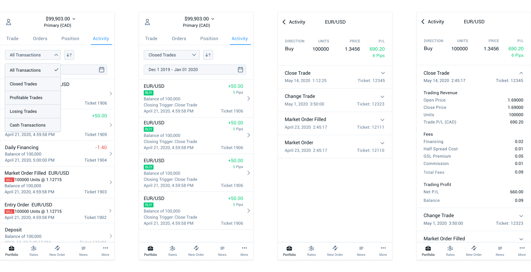
Mobile – Iteration 2
In the second iteration, we decided on the available filters, revised the detail screens to include more comprehensive information in the trade history, and refined the overall UI designs.
Light mode designs for mobile and desktop
I designed the dark mode for mobile first because our users, the traders, often check their trades and trading activity early in the morning, around 5am when it's still dark outside. I wanted to offer them a comfortable viewing experience reducing eye strain. Then I adapted these dark mode designs to create the light mode versions, ensuring consistency, usability, and adequate contrast.
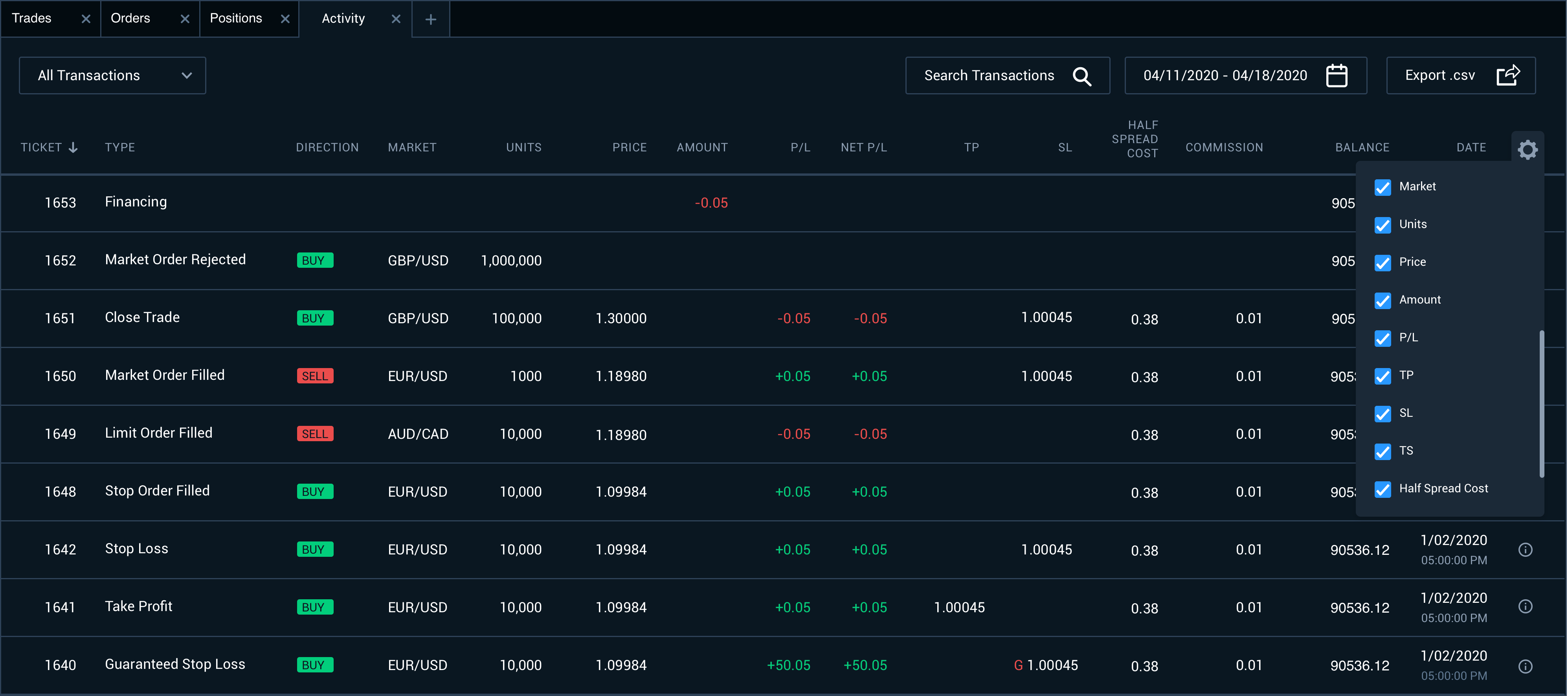
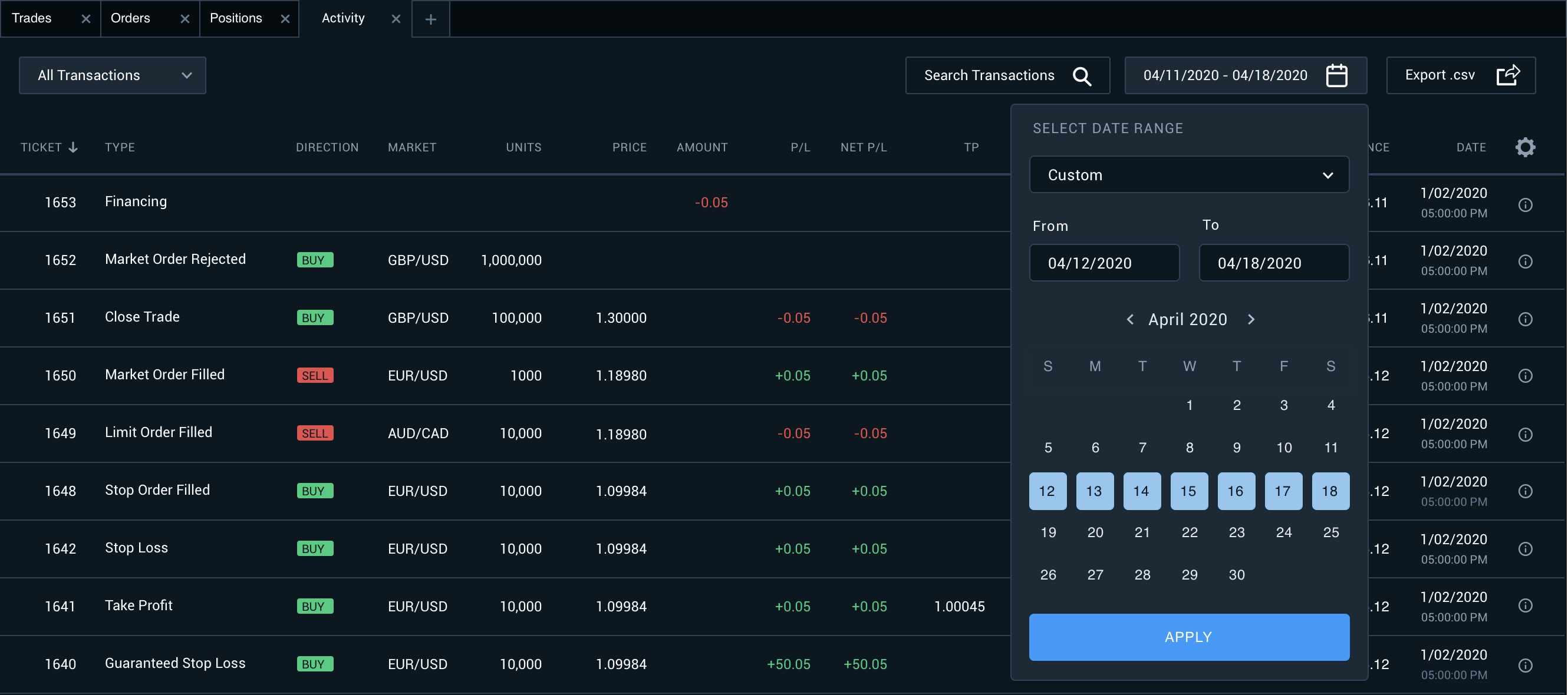
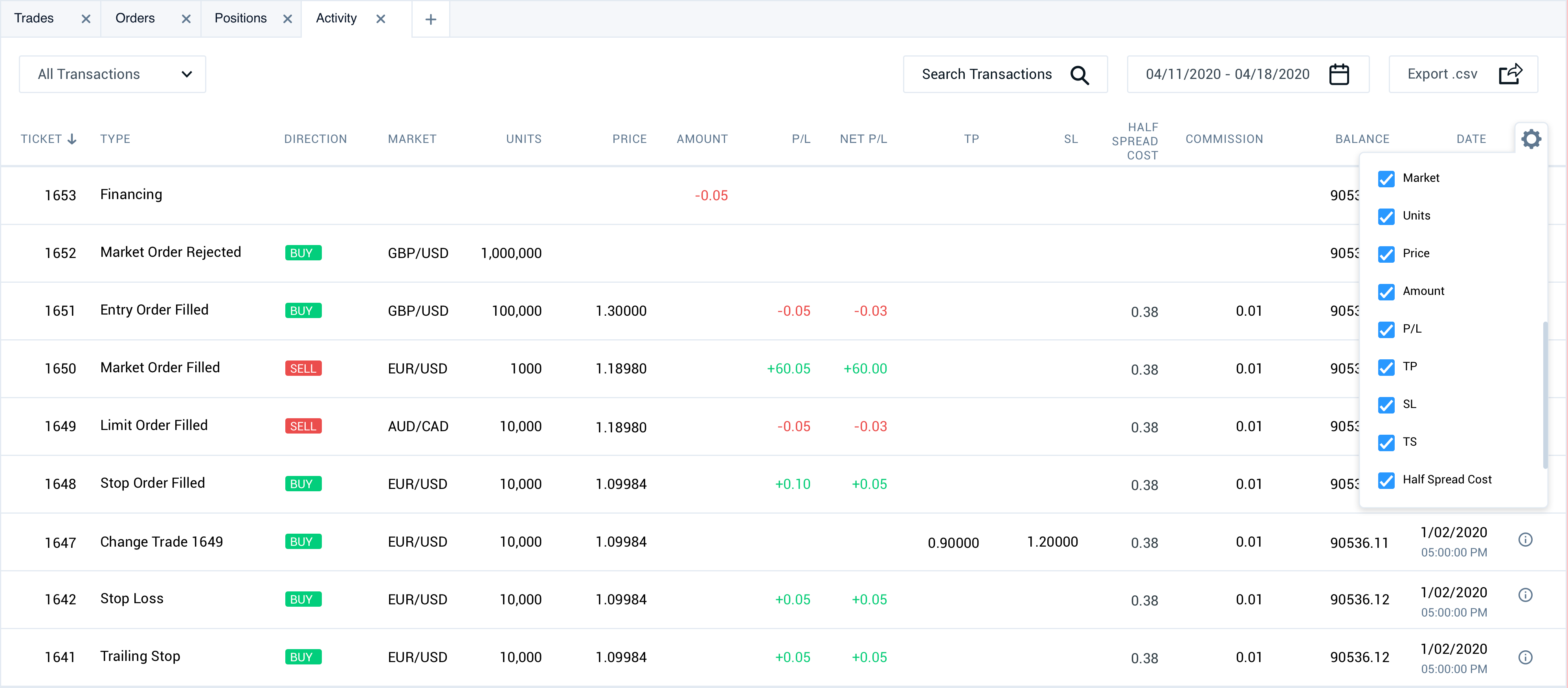
Creating a data table for desktop
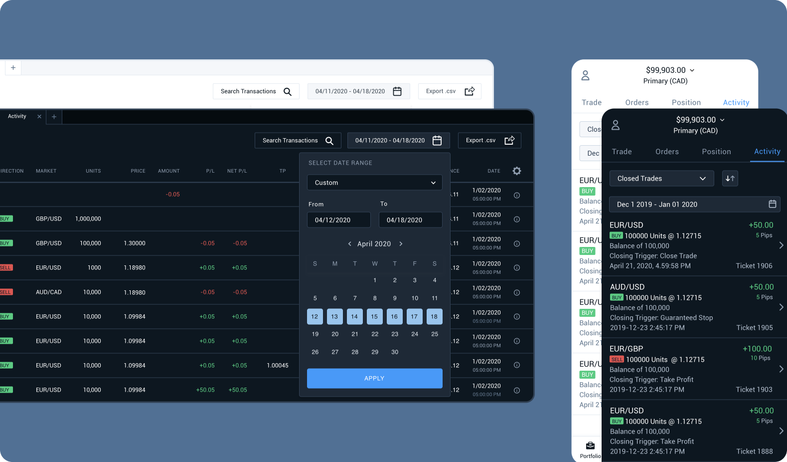
After finalizing the mobile designs and collaborating with the team on an implementation plan, I created the desktop data table. Data tables can be densely populated and may not fit within the horizontal width of a screen, therefore I made the column headers and the first two columns sticky. This allows the rest of the table to scroll both vertically and horizontally, ensuring users can navigate the table without losing their place.
Additionally, users have the option to hide or remove columns based on their current interests and needs.
I also designed a feature for downloading CSV files and importing them into Excel, as this functionality is more commonly used on desktop.
Project insights and future plans
There are several important areas for improvement in our platform regarding transaction clarity, usability, and functionality across different devices and platforms. One important feature requested by users is a detailed trade timeline, for which we'll need to make architecture changes.
Driving user engagement through transparency
The redesign made the company become more transparent and trustworthy to users. They appreciated the new design which offers more clarity and an aesthetically pleasing interface.
You made it very clear. I like the colour code with the green and the minus to show your trader’s fees.
Oanda user
Additionally, tracking clicks has revealed that the Trade Details and Financing Details views are accessed ten times more frequently than other information screens.