Introduction
Rewind began as a data backup and recovery solution for Shopify merchants, offering a straightforward interface where users could restore compromisd or deleted data.
As the product expanded to integrate with 14 platforms, our users expressed the need for a more comprehensive overview of all their integrations at a glance. However, the existing navigation structure lacked the flexibility to accommodate new high-level pages.
Recognizing this, I designed a brand-new homepage and restructured the navigation. These updates introduced a more scalable and intuitive hierarchy, providing users with a clear way to interact with their growing number of integrations.
Conducting research to identify issues and opportunities
What specific requirements do users have? Do we need a complete redesign of our platform? Or should we merely introduce a dashboard? What should we display on the dashboard in order to offer users a compelling product? What are the business goals of this redesign? What are the technical and resource contraints?
To answer these questions, I started by reviewing internal documentation and gathering user feedback. I also collected insights and anecdotes from the sales and customer success teams.
Since our primary business goal was to increase conversions, I focused on the "evaluator" persona: users from IT departments in medium to large companies who assess whether the product delivers on its data backup promises and meets compliance standards.
Our secondary persona included users who need to recover their data after experiencing issues on their end.
By synthesizing the research findings, I uncovered several key issues affecting our target audiences.
1. Unsure what is happening
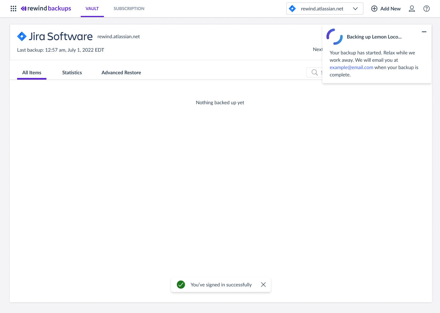
When users log in for the first time and link a new service instance, the “vault” doesn't offer updates or enough information on the progress of the backup. Users are uncertain about what to expect and lose confidence in our product's ability to fulfill its promise of data backup. This makes it harder for users to see Rewind’s value during their trial period and convert to a subscription.
2. Unsure how to navigate between instances or organizations
Navigating the app is challenging because the information architecture and hierarchy are unclear. Users land directly on a service instance by default, but many are looking for a different one and need to switch immediately. Additionally, switching between organizations is not straightforward, as the organization name is hidden under the “account” avatar icon, making it difficult to find.
3. Unclear how to check ongoing status
The interface lacks an overview of all service instances, making it difficult for users to see which ones are backed up, up to date, or require actions like re-authorizing permissions. This is a problem because users can’t monitor the status of their backups across multiple instances. This is also making our interface not easily scalable for cross-selling.
Previous implementation - No overview or backup status
Running a design sprint for alignment
I led a design sprint, bringing the product team together to share insights. I prepared for the sprint by mapping out objects, attributes and actions offering the team a complete view of our product. I also mapped out our current navigation. My research revealed that the existing navigation structure wasn't fllowing the correct hierarchy and users had a hard time navigating our product and discovering important features. I proposed addressing this issue.
Object and navigation maps
Setting goals
To ensure the success of our redesign, we set clear goals focused on user needs, business growth, and product performance. Our primary goal is to build trust with users and meet compliance standards, while also driving conversions.
User and business goals
- Ensure evaluators quickly understand the product’s functionality.
- Evaluators are confident the product is working as expected.
- Meet compliance requirements effectively.
- Provide clear, real-time updates on the status of every backup.
- Increase user awareness of all available integrations.
How we measure success
- No support inquiries about backup status.
- 200+ users link multiple integrations.
- Increased conversion rates and YOY revenue growth from under 20% to 25%.
- 250 enterprise activations from medium and large companies per quarter.
Ideas that shaped the strategy
Our design sprint collaboration revealed that a complete overhaul of the product wasn’t necessary to deliver value to our users and meet business goals. While other areas of the product could benefit from improvements, user feedback indicated fewer complaints about those parts. Instead, we decided that creating a homepage where users could land and which tied the product together, was a feasable and impactful solution.
Object and navigation maps
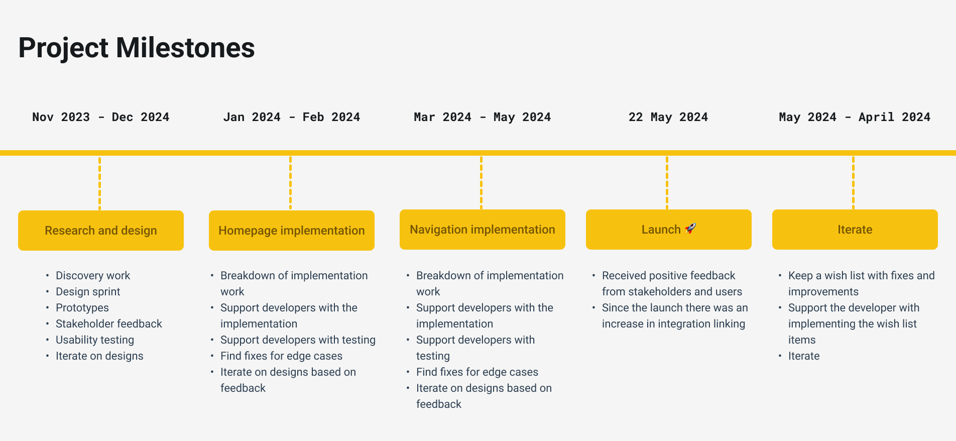
Setting milestones for a phased and iterative redesign
I convinced the team and executives to go beyond simply adding a homepage, advocating for a navigation overhaul to
make the product more coherent and discoverable. To achieve this, I formulated a design and implementation strategy.
My proposal was to first implement and test the homepage, then roll out the new navigation structure. This second
phase was more complex, as it impacted all product views and required more extensive testing to validate my ieas.
Designs
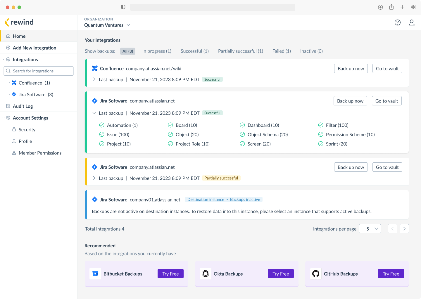
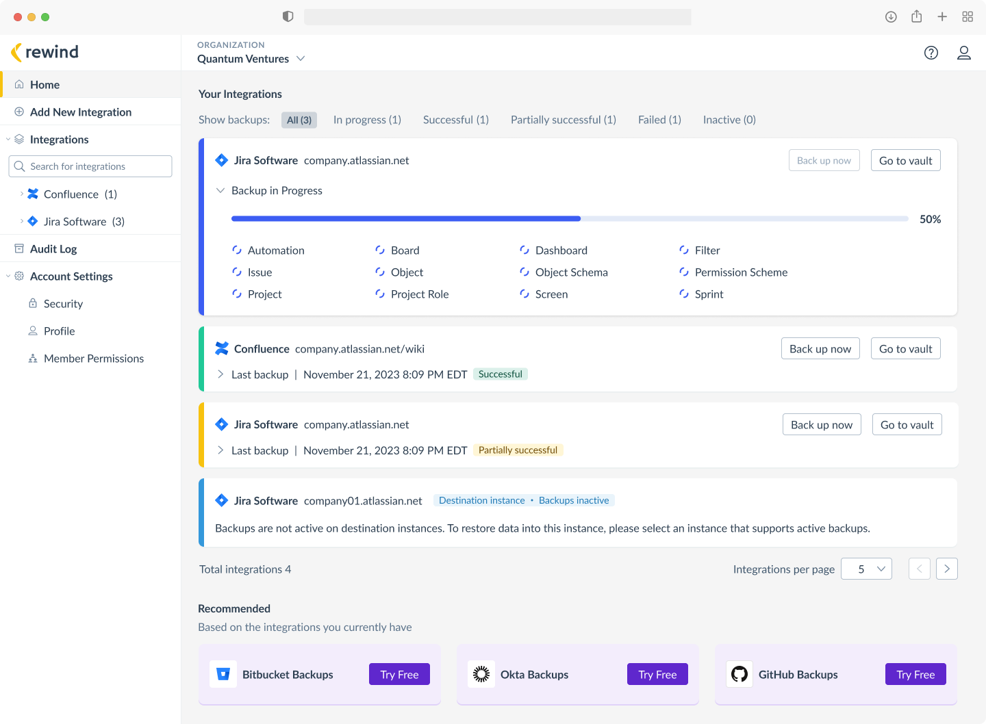
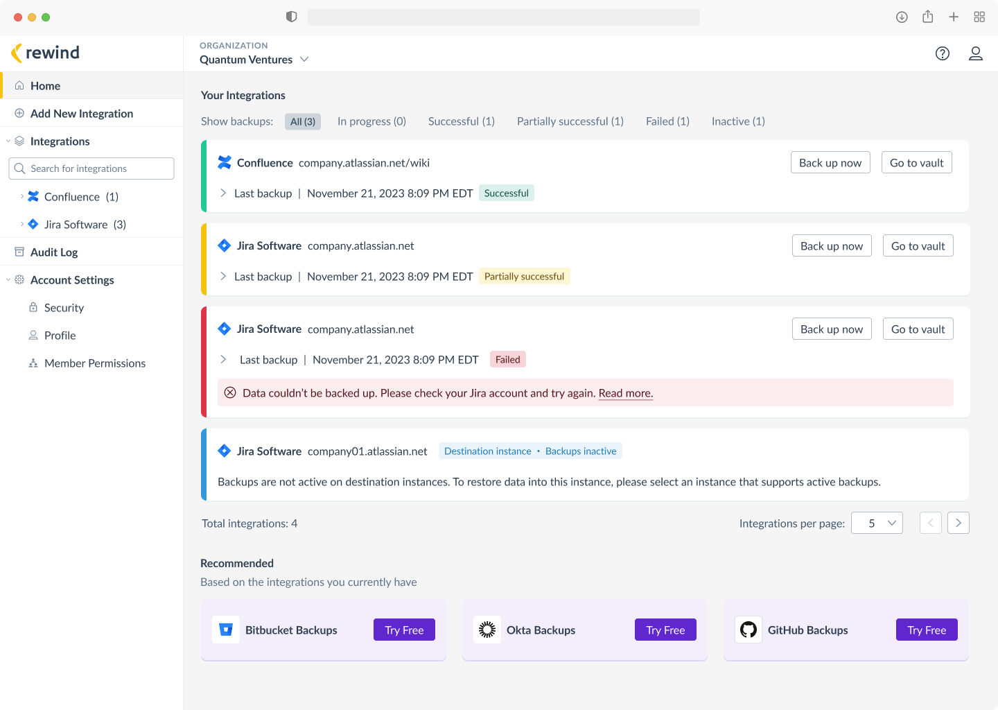
I designed a home page with an overview of all integrations and backup statuses. Users can expand backup status rows to view item types and counts from the last incremental backup. They can run a manual backup or access all backed-up items of a particular integration.
Since users mentioned they weren't aware of other integrations we support, I added a section recommending up to three integrations relevant to each user. This made unlinked integrations more discoverable.
Making a case for transitioning to vertical navigation
It was clear to me that the existing top horizontal navigation was not optimal for our SaaS app, but to make such a significant change I had get buy-in from the leadership. I made a strong business case to justify the investment.
I conducted research and reviewed technical articles on navigation patterns, synthesising the findings in a list outlining the pros and cons of transitioning to a side vertical navigation. This allowed me to present a comprehensive analysis to the leadership team, including our CEO.
Left vertical navigation
Vertical lists are easier to parse because they are left-aligned.
Vertical scanning is more natural for people.
Scales well, as product grows.
Navigation items are more easily discoverable.
vs.
Top horizontal navigation
Saves vertical space, maximizing content area.
Works best with fewer navigation items.
Works well for web apps without hierarchical structure.
The left most item carries more visual weight than the other items because of its placement in the primary optical area (top left).
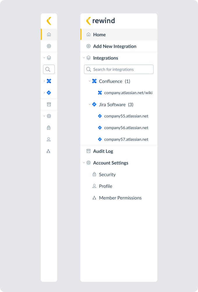
One benefit of restructuring the navigation was improving the usability and discoverability of our product. For example, the audit log that was previously hidden under the account settings avatar icon is now moved to a prominent place in the side navigation. This aligns with the unique needs of our enterprise customers, who sometimes access our app with the sole purpose of viewing the audit log.
By thoroughly evaluating the options and articulating the potential benefits, I was able to secure buy-in from the leadership for the navigation redesign.
I gathered the different views in our app and mapped them onto the new navigation structure to ensure it works for all cases.
Navigation mapped to views
Usability testing
I created a prototype and tested it with eight users, gathering their feedback into a list and assessing which suggestions were feasible to implement. Using this input, I iterated on the designs to refine the experience.
I conducted extensive testing within the team. I conducted thorough testing within the team. Next, we opened the feature to everyone in the company, encouraging them to find bugs and offer feedback—A lollipop was offered as an incentive for participation!
Two weeks before launch, we introduced the feature to a select group of users for more feedback.
Impact and next steps
The redesign was positivelly received both internally and externally.
Just a shout-out: I love the new UI on our app. It looks much cleaner and is closer to the Atlassian UI. Nice job, team!! Super powerful to show how easy it is to click into a completely different backup platform from the left (single pane of glass)!!!
Rewind leader
The layout is more clear to me with the tree of products/instances on the left, with the distinction between each product (Confluence, Jira). I like this better than the previous layout.
Rewind user
Since launch, we've seen an increase in the number of integrations users have linked. For example, one user who had only a single Shopify integration for two years added two new integrations, Trello and Klaviyo, shortly after the homepage launch.
Moving forward, we're keeping a wish list with improvements and fixes to which anyone can contribute.
