My role
UX/UI designer on the project. Worked in a agile environment with developers, QA, product owner, digital project manager, business analyst, solution architect, and scrum master.
My responsibilities included: user research, product strategy, competitive analysis, content strategy, user flows, sketching wireframes, interactive prototypes, in person and remote usability testing, visual design, interaction design, and communicating specs to developers.
Problem statement
- Only 50% of users who open a bank account register for online banking. Industry leaders achieve 80%.
- Current website is not responsive and doesn't offer a good experience for users who want to enrol on their own on their phones.
- In-branch enrolment process in not integrated in the opening account flow. When the account opening process is completed, in-branch employees need to go to another application and enter all the user data again in order to enrol them in online banking.
Business goals
- Increase the %50 enrolment to closer to %80
- Drive less calls to customer contact centre
- Help branch employees to solve the customer needs faster
Research methods
User interviews
- With branch employees, about their process and opportunities for improvement
- With users, about registering for an online banking account
Contextual inquiries
- I observed branch and customer centre representatives open accounts and enrolling users to online banking
User journey
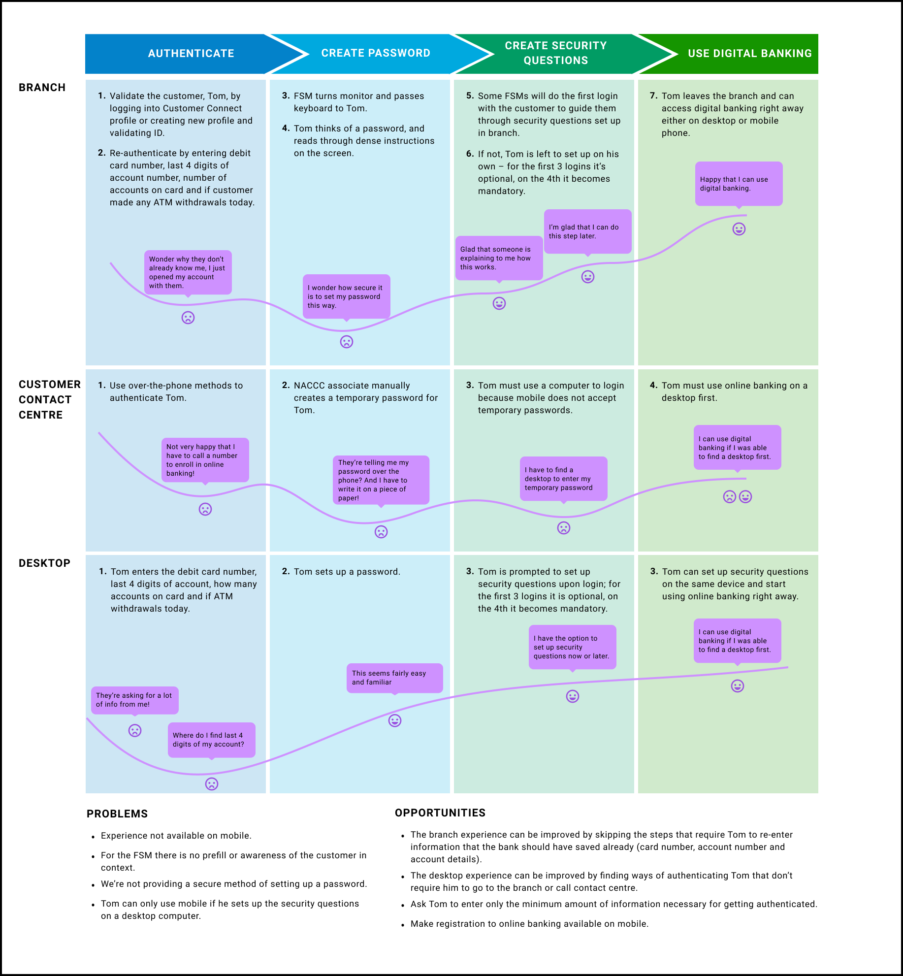
User goals
- An improved experience of in-branch enrolment process, a seamless and easy process.
- The user should ask to enter only the minimum amount of information necessary for getting authenticated.
- Improve self-serve user experience for online banking registration on both desktop and mobile channels.
User scenarios
- User opens new account online and registers to online banking at the end of the process.
- User opens new account online or in person and registers to online banking in branch.
- User has already opened an account and self-registers to online banking.
User flows
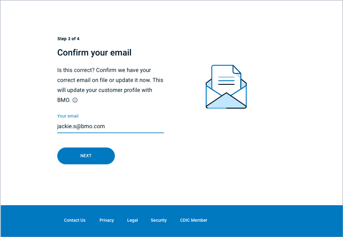
For the MVP we're redesigning the registration section of our online banking website.

The branch experience can be improved by skipping the steps that require the user to enter their card number, account number and account details.
The online experience can be improved by optimizing the process on mobile.
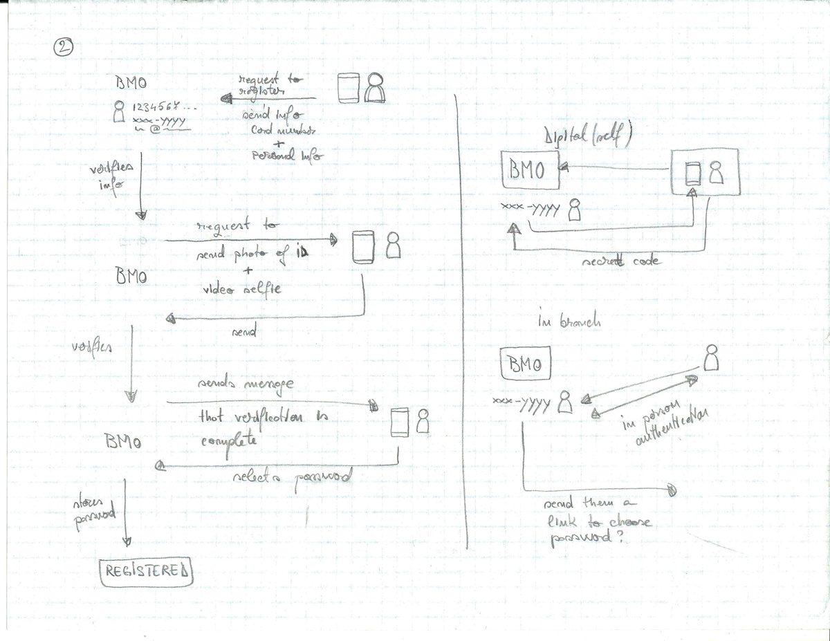
Future releases - use biometrics as methods of identification and possibly eliminate visits to the branch for registration.

Sketches
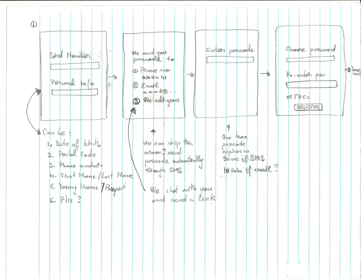
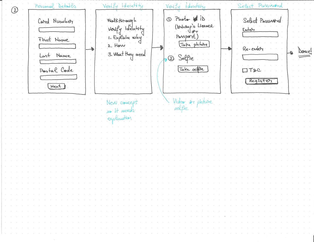
Mobile wireframes

Mobile mockups

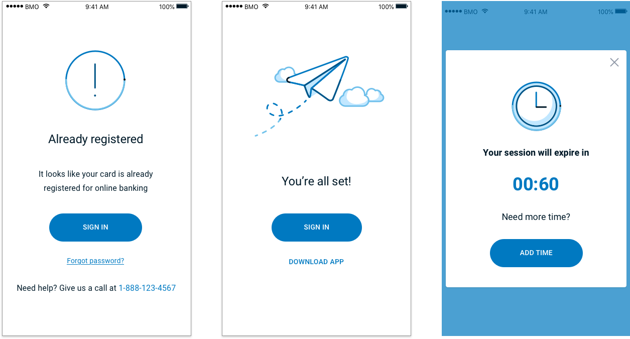
Desktop mockups
